
As you can see in this article, the style lets all the lines appear symmetrical, by manipulating spaces to 'justify' the position of every last letter, not leaving empty spaces on the right of some lines like how steemit articles are normally written.
A common type of text alignment in print media is "justification", where the spaces between words, and, to a lesser extent, between glyphs or letters, are stretched or compressed to align both the left and right ends of each line of text.
-- Wikipedia: I couldn't do a better job describing it.
It immensely beautifies the article!
How to do it?
If you're familiar with HTML & CSS (and you should be.) You have to add a div tag with the class of text-justify. You could do it for each paragraph, or just once on the top of the article then close the tag at the end. I recommend the latter, but it lets you control lines less.
This Example:
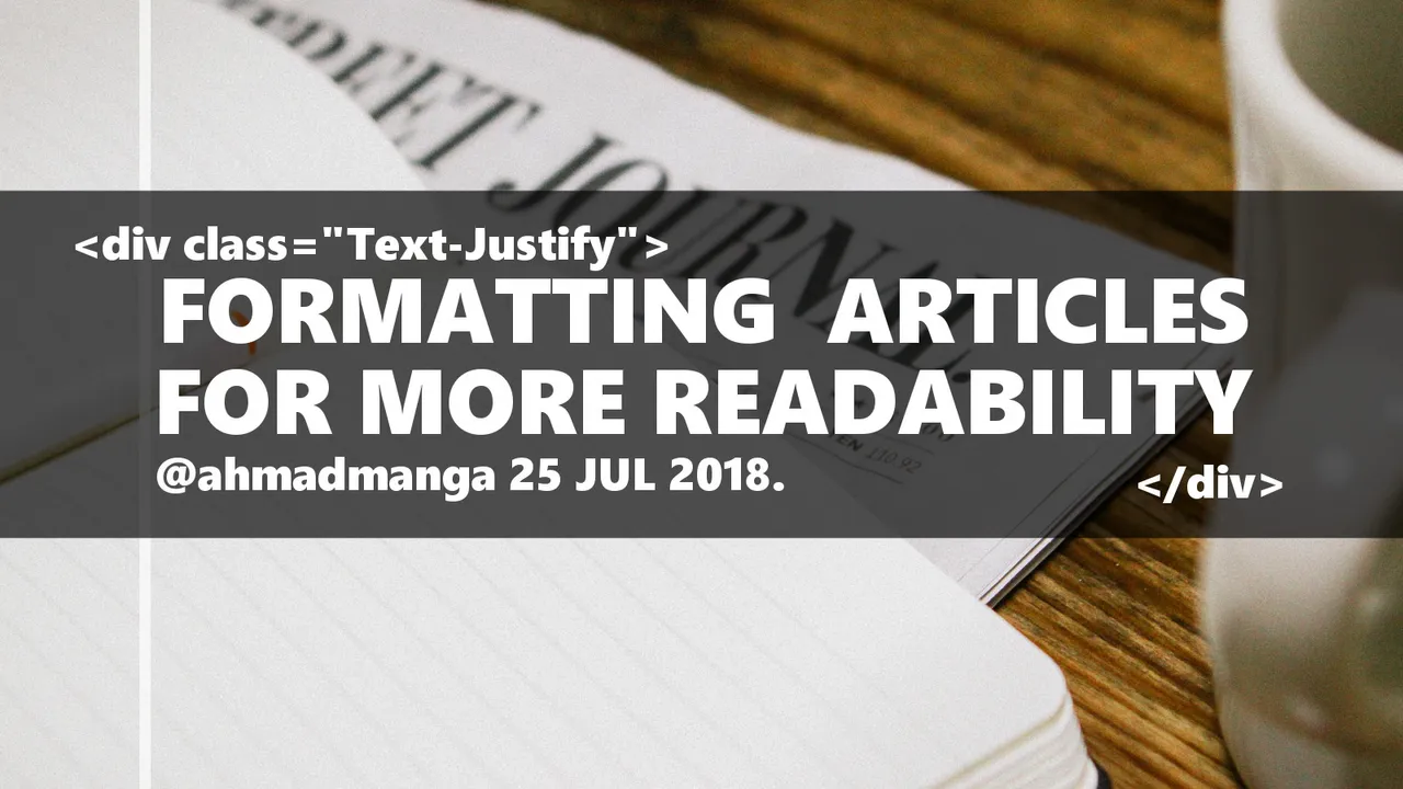
<div class="text-justify">
This paragraph uses the text-justify class. Some Markdown elements like ~~strike-through text~~ for example, won't work on justified mode. You have to use the HTML classes for that.
</div>
This paragraph uses the text-justify class. Some Markdown elements like ~~strike-through text~~ for example, won't work on justified mode. You have to use the HTML classes for that.
Would appear like this without Justify:
This paragraph uses the text-justify class. Some Markdown elements like
strike-through textfor example, won't work on justified mode. You have to use the HTML classes for that.
What do you think?
Using HTML & Markdown formatting might be hard at first but it's completely rewarding. Text justify div class gives you the power to make your posts more beautiful & readable. I didn't know it was possible on steemit, I would have researched it sooner if I did.
Still, I don't know if this works on all the platforms on STEEM blockchain, or if it works on any other place on the web at all. So I'll be happy if someone can tell me about that.
Salam (Peace)