
Complaining is easy. Doing something about it is harder.
One thing I like to bitch and moan about is the fact that Steem Engine doesn't pick the low hanging fruit in usability and integrate simple line charts.
An order book is very nice to have. Without the most important thing - price performance - it is almost useless.
The first thing you need to know if you want to make a trading decision is price performance over time. Only in a second step do you want to know how much of the asset can be moved at what price point.
As a first Chart I decided on the most prominent SE token: PAL
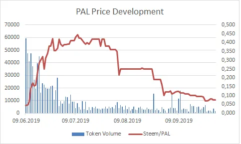
Left Y-Axis: Token Volume
Right Y-Axis: Steem/PAL
Horizontal Axis: Time
Starting date: 09.06.2019, End date: 01.10.2019
I cleaned the first days of trading out of my data set because they were unusual and don't add much information.
For pricing information I chose the daily low in order to be conservative. This is not important for a fairly liquid token like PAL but it will be a more realistic choice for more sparsely traded ones.
If you want to make charts on your own, go ahead and do it. It takes some steps but its not hard. A few basic Excel skills is all you need. Mainly formatting data and charting.
@harpagon made two posts on how to get json data from the API. Here is post 1 and post 2.
This is the call I used for the above data:
https://api.steem-engine.com/history/marketHistory?symbol=PAL
Have fun charting!